Which cover do you like better for my Mom's Kindle ebook Active Senior Living. Do you prefer the current one:

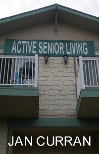
Or this new one?
Or should we start from scratch?
UPDATE 5/1/10: We listened. We scrapped the new one and stuck with the old one. So what do you think of this one? Does it capture the humor and the heart?
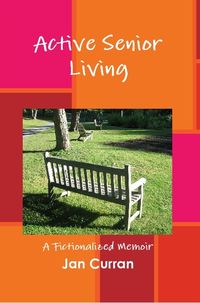
I prefer the current more colorful version. The photo version looks a bit dull. Visited your Mom a few weeks ago in her palatial estate — okay, her charmingly intimate quarters. It was wonderful to see her — after all, she is my sister!
The second one looks like crap. And not true to the book — it looks like a crime novel.
Definitely start from scratch. Both covers scream “inactive”, the second one is depressing, and neither give any clue as to what the book is about. I never would guess it’s a novel, particularly not a humorous one, from the cover. I gleaned that from the description on Amazon.
The first one is preferable, but I would say neither are ideal. I’m not sure they would scale well or work in B&W on a Kindle screen.
Kindles are still B&W, yes?
As a graphic designer, I would do a variant of the first in line art and make some changes to the font and colours.
The first is more eyecatching due to the colors. The second looks more professional, but for some reason I don’t like it much. Perhaps it’s the colors, which are a bit subdued.
Either, but I would add a prop to the bench or the balcony to emphasis “active”. Empty benches and balconies seem to negate the title and purpose of the book. (And, no, the prop doesn’t have to be roller skates.)
Top
I prefer the original.
Lee, I reckon you need a couple of happy, healthy seniors on the cover, indulging in some kind of physical activity. As things stand now, the covers are too static.
By the way, how is the arm?
Joe West
The old one, because it is sunny and bright. The second one is dark and the sign is out of focus.
I prefer the new one…although I think you could pop it up some.
IMO, neither cover gives any indication of what the book might actually be about and “A fictionalised memoir” is kind of vague.
The bottom cover is just plain boring while at least the top one has jazzy background.
Maybe a nice quote from a review should be on the cover.
New one.
No active seniors on the covers. The first one almost says DEAD seniors. The second one looks like a real-estate ad photo.
first one.
second one is depressing in a way that i can’t really explain. unless that is the objective of the book?
The current one. On the new one, the author name is so bright it buries the rest — and your mom may be dear, but her name doesn’t sell books.
The first one with a different picture (meaning…one that shows something ‘active’ instead of a bench) would work nicely, I think.
The title sounds like a government pamphlet, the kind that strongly advises the elderly to exercise more and eat healthy.
The current cover has got one thing going for it: cheerful colours. But the empty bench looks really lonely and it is strangely at odds with the title. Did the active senior perhaps die before the book came out?
I really don’t know what to make of the other cover. There’s something regimental about the place depicted. A summer camp for seniors where they’re trained to become more active?
Well, um, both covers are horrible. In the first, who would want to buy a book with an empty lawn chair on the cover? What’s the point? What’s the hook?
In the second, who wants to buy a book with a wall on the cover made of concrete blocks? Who wants to enter such a bleak-looking story world?
I like irony, but not in the title of a book as it is misleading. So the key word in the tile is “Active.” If this is meant ironically, then the title should be changed. If this is meant seriously, then the cover graphic needs to show a bunch of seniors doing something very actively–which is the hook, which is the point. So we need some seniors in front of a state capital building, actively involved in the political process, making a difference–else, why read the book? The title and the cover should challenge the reader’s assumption that “senior living” is a slow waltz towards death, towards meaninglessness, towards marginalization by society.
I can see a white background, with the name “Jan Curran” at the top, a black graphic of a state building with a black crowd of seniors in front, with the title below.
With this type of cover, I want to read the book becauss I want to know what the seniors are all worked up about, and if they change society or not by their efforts.
The second cover reminds me of the warehoused elderly, and is gloomy too. Might there be a lovely portrait of your mom that would be the basis for a cover?
The colorful one matches the name of the book – it’s optomistic and lively. The other looks a bit like a depressing old person warehouse. So, depending on the story inside one or the other will work better.
Start over. Neither cover would make me want to open the book. I wish I could think of something that would. But my mind is blank right now. Sorry.
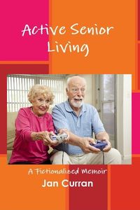
All your comments are EXTREMELY helpful! We will stick with the “old” cover while we tinker with something else that might better capture the humor, fun, and drama of Mom’s book. I’ll present some choices to you again soon.
Good call. The second photo definitely does not say humor or fun.
There is good reason why virtually all fiction, history, and biography have people or portraits on the cover. People sell books. People, or portraits, add warmth and make the contents less abstract. In the product of New York publishing, human images are present whenever possible.
Scratch. Start from scratch.
If forced to pick between the two, I’d go with the first one. It’s colorful and the font has a little motion in it. The second one looks forbidding, looking up at this dark building. It looks like the type of place where people check in but never check out.
If not forced, I’d start from scratch. The cover should project activity, which neither of these do, and seniors want to think of themselves as active, not sitting on a bench.
That’s my 2 cents worth, and you can give me a penny change if you like.
Well, truthfully, neither looks very active. Maybe you could get a photo of some seniors busting a move or something. lol.
The current one is best. The new one
is not at all attractive.
I prefer the first one too. 😉
Newest one is the best yet. However, you may want to change the colors of the frame; where in the original version, it contrasted with the photo, now it matches the photo, and I think that weakens it.